One interest I haven’t written about much on this blog is airline identity and branding design… I guess you could say that I actually care what the marketing departments at the airlines are trying to communicate to me. There are a bunch of books on this subject, and I’ve been building a collection of them for a while.
Working on my Flying Blue post yesterday brought me into contact with KLM’s logo, and looking at the image of the award calendar that I put up just underscores how brilliant of a logo it actually is. In fact, any logo in service for over 50 years with only minimal updates proves its worth simply through its longevity. However, I think KLM’s logo is uniquely brilliant in how it blends corporate modernism with the brand’s history as the world’s oldest continually operating airline.
Look at the transition between 1958 and 1961 – this is the reset that positioned KLM for the jet age, and it has barely been changed since then. Earlier iterations of the logo tried to preserve some aspect of the original logo’s designation of KLM as a “royal” airline, although by the late 50s, the crown was mostly outdated and tired looking. By reducing it to three main components, each represented by extremely simple geometric shapes, KLM now had an instantly recognizable logo that evoked sophistication and efficiency while still tying the brand back to its Dutch royal heritage.
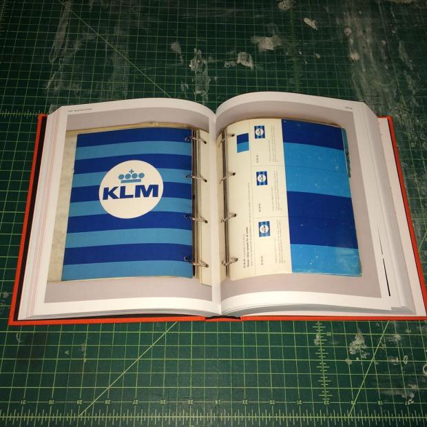
The designer responsible for this update was FHK Henrion, a British designer originally from Germany. (Henrion also designed the logo for BEA before they merged with BOAC, but I actually prefer BEA’s previous logo.) Unit Editions in the UK recently published an excellent retrospective on Henrion’s career, from his early days as a poster illustrator to the prime of his career, when he designed corporate identity programs for companies like KLM, Tate & Lyle, and the London Electricity Board. The KLM chapter is essential for any fan of airline identity and design, as it includes a generous selection from the official house style manuals that Henrion’s group produced and then revised.
Part of the reasoning for the very wide font and geometric crown was Henrion’s theory that planes are viewed in motion and that logos need to be recognizable even when they’re blurry. He subjected various logos to blur tests to see how legible they would be under various conditions and tweaked the KLM logo accordingly.
Overall, the KLM logo is probably my favorite one currently in use, and not just because I’m generally a fan of Dutch things. I applaud KLM for resisting the temptation to reduce their logo to some dumb swooshy thing (like Air France or American), and I hope they keep it in use for a long time to come. Finally, here’s a photo I took out the window from my first KLM flight earlier this year:


This is a very cool post!
LikeLike